|
|
Navigation |
|
|
|
The following describes the layout of the site and the navigational tools.
A slide presentation
is also included for an illustrated narrative on the layout and navigation
features of this site.
|
 Navigation Basics
|
|
The theme is that of a file cabinet filled with folders.
Clicking on a file cabinet drawer
exposes its folders, which are shown in a row at the top of the page.
Clicking on a folder tab displays its content as a Web page.
|
|
Each page displayed includes the file cabinet on the left and rows of folder
tabs on the top. The tab currently being viewed is highlighted.
Every page on this Web site can be reached directly by selecting
a combination of file drawer and file folder.
|
Clickable “top” arrows ( )
are periodically placed on long pages. They
take the viewer to the top of the page for navigation to other pages.
The end of every page is marked by a diamond icon
( )
are periodically placed on long pages. They
take the viewer to the top of the page for navigation to other pages.
The end of every page is marked by a diamond icon
( ),
which also takes the viewer to the top of the page. ),
which also takes the viewer to the top of the page.
|
It is also possible to navigate the pages by following the “previous”
( )
and “next” ( )
and “next” ( ) arrows
at the bottom of the page. ) arrows
at the bottom of the page.
|
 
|
 Nested Tabs
|
|
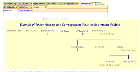
Some folders have nested tabs, which appear in a row just below the
highlighted tab. The second row may also include nested tabs, displayed in a third row.
The nest of tabs on a row is contained within the highlighted tab
on the row above. The figure below is an example of the hierarchy of the folders.
|

|
|
The number of tabs and level of nesting varies according to the scope and
complexity of the subject matter.
Many folders have no nested tabs at all.
|
|
In some drawers, a number or letter is shown on the right side of each tab
that corresponds to the sequencing of the pages, as in a numbered outline.
See, for example, the map on the root page of
the “Stray Voltage” drawer
[example].
(Use your browser's “back” button to return here.)
Each tab appears in the outline on the Stray Voltage root page
[Stray Voltage]
as a combination of numbers and letters.
|
|
The “previous” and “next” links at the bottom of each page
follow the sequence of this outline,
following the nested tabs top to bottom and left to right.
This is the sequence recommended
to first-time visitors or those new to this subject matter.
|
 
|
 Links
Links
|
|
Text-embedded links (hyperlinks) are shown in blue, becoming underlined once they have
been visited.
These links may be used to navigate to a different page or to
access additional information. Two styles are used to differentiate between these
two types of links.
|
|
Square brackets around a tab heading indicate a link to another page on this site.
Clicking on the link takes the reader to another section as shown in this example
[Navigation-Links], which jumps to the heading of this section (Links).
Using the browser back button returns the user to the previous page.
|
|
Links with no brackets open pop-up windows, which display
additional information on the subject as shown in
this example.
The pop-up window may be closed by clicking on
“Close Window” at the bottom of the pop-up page.
Each pop-up window has a built-in timer that closes
the window automatically after a predetermined period of time.
This helps keep the screen from becoming cluttered. Pop-up windows have an
off-white background to distinguish them from regular pages which have a white background.
|
|
|
 
|
 Animation
|
|
Animation is used to create figures,
to present a slide show, or to enable interactive exploration.
“Show me” and “stop” icons are located above drawings in which such animation
is present.
|


|
|
The “show me” button starts the animation,
which continues until the “stop” button is used. |
|
In a slide show, the display resumes automatically when it reaches the end.
Use the “stop” button to end the animation at any time. |
|
Interactive explorations can include a number of buttons and clickable items
within the figure itself.
|
 
|
|
|


|
